by Jackie Rockel

It was the last in person botanical art class before Covid, but we didn’t know that then. The assignment was trees. Panic ensued. Trees are majestic and I find it nearly impossible to figure out how to depict them with the accuracy and detail that I strive for in botanical drawing. But class work is a challenge and that was why I was there. There is a spectacular old birch tree at the bottom of my street which is especially appealing in the winter against a cold blue sky. Drawing that tree was my goal. To add to this challenge, I decided to try using tinted graphite which has subtle and some not-so-subtle color variations. I had been introduced to the medium but had no experience with it. This is a little bit about what I learned and why I think it is worth a try especially for late fall and winter projects.
The tinted graphite that I was using is made by Derwent in pencil form and it is water soluble. The first challenge for me was figuring out how to plan a color palette. Unlike Prismacolor pencils, Derwent only puts the color of the pencil on the end of the pencil. In addition, I didn’t find the colors on the pencil to be true to the drawn experience. So, I made a color chart.
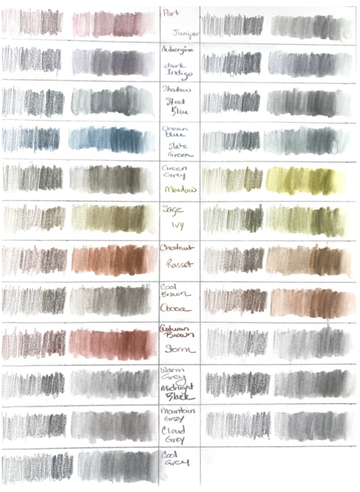
The chart shows color gradation with the pencil alone and then water added over the pencil. I expected this exercise to be boring, but it turned out to be fun to just lay the colors down with no expectations. As you can see some of the color variances are subtle, some of the colors are more muted without the addition of the water, and huge sections of the color spectrum are missing. There is a white pencil which I omitted from the chart. Notably there is no yellow and no true red, or blue. Missing primary colors? No, problem. These colors however were perfect for my birch tree, I just needed to decide which ones. A task made easier now that I could see them.
I work mostly with colored pencils, usually Prismacolor with a smattering of Faber-Castells and Derwent Lightfast. I have also done some work with graphite and pen and ink. I only have watercolor pencils for fun, so I have very little experience with them. The tinted graphite pencils work far more like colored pencils than graphite pencils. They have a wonderful creamy feel when applied to paper. They can be layered just like other colored pencils to achieve more color variations.
For the birch I didn’t need many layers, but for this article I tried to see if I could get some vibrant colors applying the colors heavily and layering them and it worked fine. The colors can be erased but just like with other colored pencils if the pigment gets into the paper, you will not be able to completely remove it.
To try to show how these behave in comparison to actual graphite, I made a little chart. I was unable to find out what is used as a binder in these pencils. Derwent uses wax for their watercolor pencils and oil for their light fast colored pencils, so it could be either.
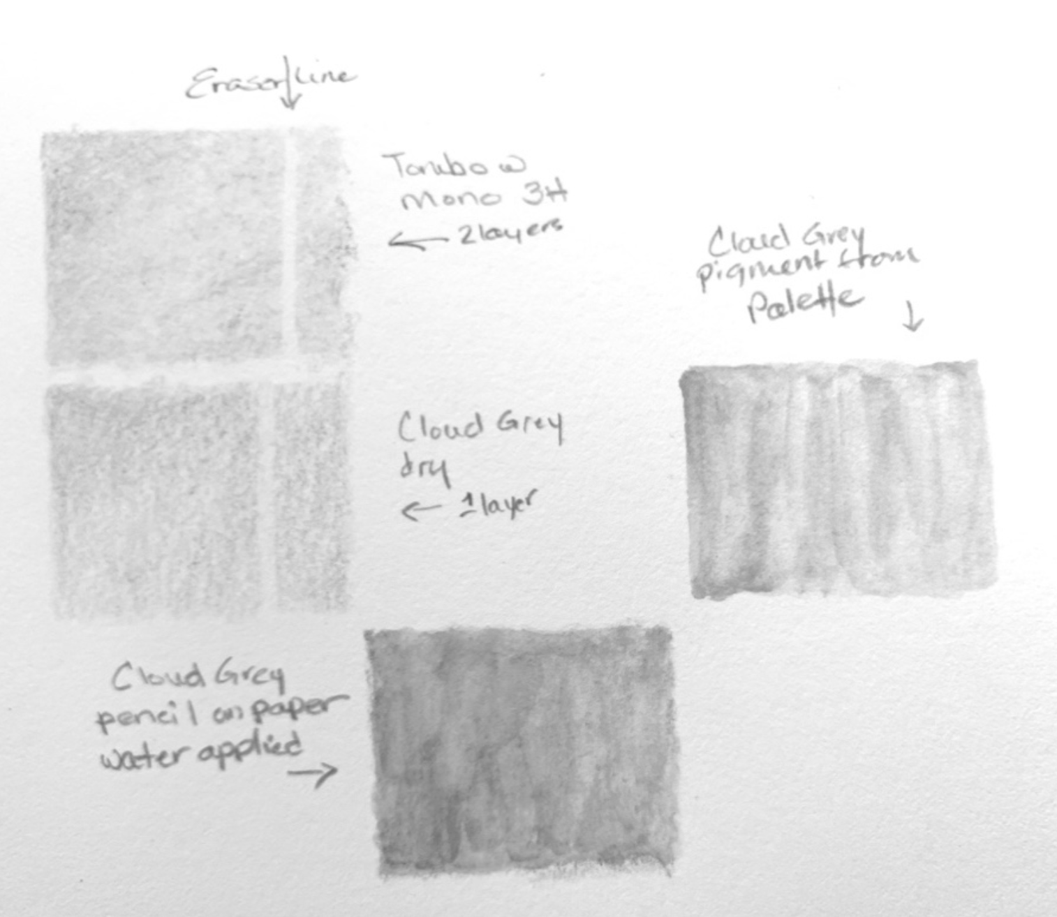
The top left rectangle is two layers of Tombow 3H graphite. The bottom left is one layer of Derwent Cloud Grey. The colors are similar, but the graphite obscures the grain of the paper better. You can see the grain through the Derwent which tends to lay on top when applied gently. Both erased but the graphite was lifted more completely. The other two rectangles were made using the pencil and water. The bottom rectangle was made by applying the pencil to the paper and then washing over it. It’s messy and speaks to my lack of skill in this area. The right-hand rectangle was made by extracting pigment from the pencil using a rough Caran D’Arche palette which was developed for that purpose. You scrub the pencil over the palette and then pick up the pigment with your wet brush from there. This process is tedious and likely the reason that Derwent now offers pan colors so that you can pick up the pigment more consistently and easily.
For the birch tree, I was interested using the pencils dry. I focused on the trunk, lower branches, texture of the bark, wounds in the tree from losing branches, and the lichen that has found a home on the tree. The few smaller branches I was able to incorporate show more of the original white of the bark which makes the tree so striking against a blue sky. Because of the many variations of shade and texture, as well as the presence of knots and lichen, I ended up using more of the pencils than I would have expected. There is more blue and brown in the original than shows in this copy. The lichen was done combining blue and green (Meadow and Ocean). The knotholes used the darkest browns and the shading was done with the grays, Cloud Grey being my favorite. I believe that I found a way to represent the personality of the tree, if not it’s total majesty.
What a gift that January 2020 class was. I learned a lot about different trees that other students were drawing and even found a shagbark hickory on the corner of my own lot that I had no idea was there. The students from that class still meet monthly online. Some have moved on from botanical art and some have not but we are still there to support one another in our art journey. And I have a least a little understanding of how of tinted graphite works and I love working on winter projects with it. I hope that you will also be inspired.
Jackie Rockel
